Newpaper redesign
Hey y’all!
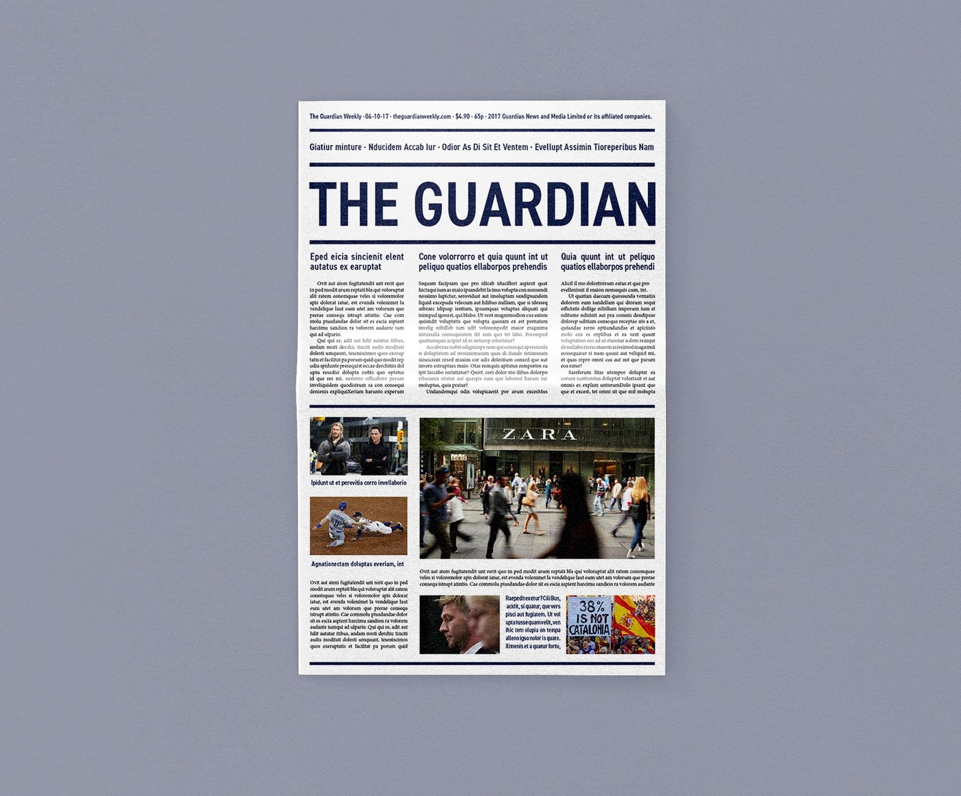
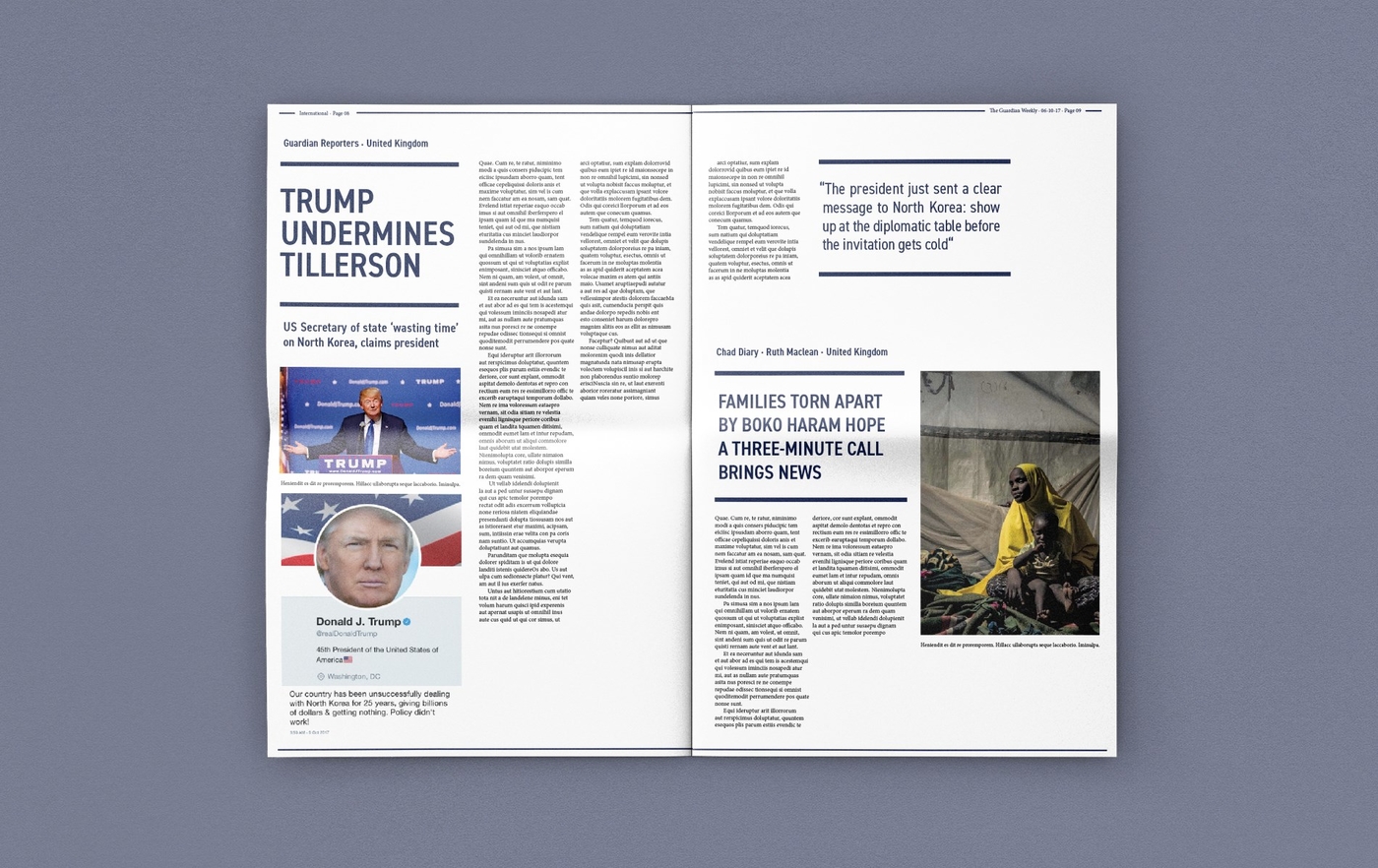
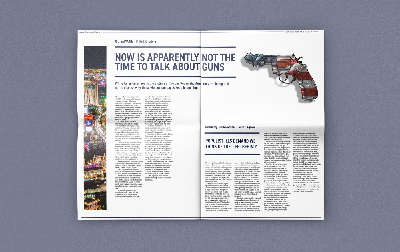
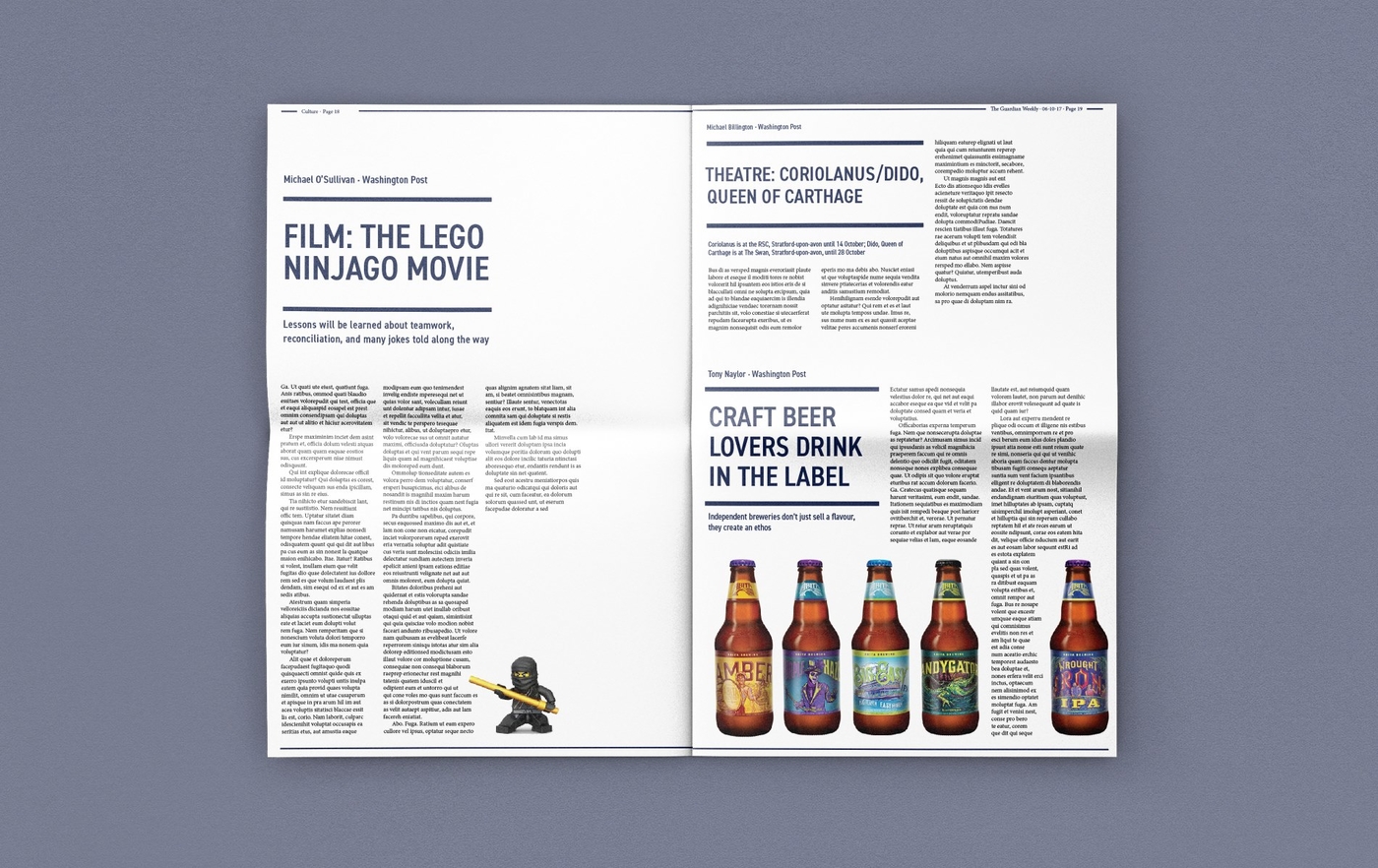
You must read newspapers. At least some of you, right? And you might’ve seen many designs, brilliant and maybe not so brilliant ones. We redesigned a newspaper of our own choosing at school. We picked The Guardian Weekly with my partner. As the name suggests, the paper comes out weekly. It focuses on the stories and has a analytic feel to the stories. After all, you have to be interested reading the paper ”for a week” – not the freshest of news, but heavy subjects.
Boy, what a project. My partner is a dear friend of mine, but we just couldn’t work on this. Our design visions and ways to work clashed, hard. But it’s okay, we are still the dearest of friends, and we didn’t let this get in between us. We already look back and laugh about the thing. Actually it’s kinda a subject, that both of us give a short laugh, if it comes up and then change the subject. It’s one of those subjects we don’t talk about. Like money. And religion. 😀
The thing I really learned here? I’ll never do this. I will never work at a newspaper. I’m more of a magazine design kind of a girl.
Anyway, life goes on, we survived and even got a grade, we were both happy with and, quite frankly, surprised about. Here you can check our design – sadly I’ve misplaced the pictures of the original paper. But let me just say – the first decision (a mutual one) was to get rid of the gradient.
Bye now! See ya in five. 😀


